 |
bostonbubble.com
Boston Bubble - Boston Real Estate Analysis
|
|
SPONSORED LINKS
Advertise on Boston Bubble
Buyer brokers and motivated
sellers, reach potential buyers.
www.bostonbubble.com
YOUR AD HERE
|
|
DISCLAIMER: The information provided on this website and in the
associated forums comes with ABSOLUTELY NO WARRANTY, expressed
or implied. You assume all risk for your own use of the information
provided as the accuracy of the information is in no way guaranteed.
As always, cross check information that you would deem useful against
multiple, reliable, independent resources. The opinions expressed
belong to the individual authors and not necessarily to other parties.
|
| View previous topic :: View next topic |
| Author |
Message |
admin
Site Admin
Joined: 14 Jul 2005
Posts: 1826
Location: Greater Boston
|
 Posted: Thu Sep 29, 2011 9:12 pm GMT Post subject: Boston Bubble Wrap: The Real Story for MA - Aug 2011 Posted: Thu Sep 29, 2011 9:12 pm GMT Post subject: Boston Bubble Wrap: The Real Story for MA - Aug 2011 |
 |
|
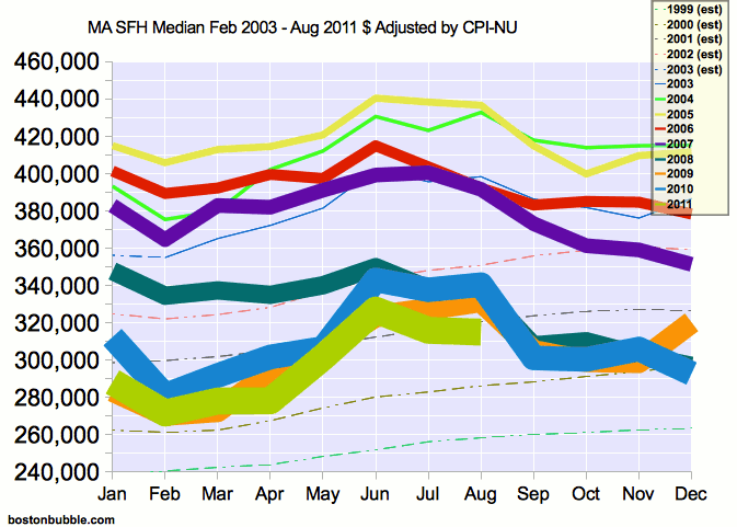
This is a brief report on what the data for the housing market in Massachusetts looks like in real terms. Market data is typically reported in nominal terms which can be misleading because it combines changes in housing values with changes in the value of the dollar. Correcting for inflation removes changes in the dollar as a factor and gives a more accurate picture of how housing values have changed. This report is based on the published data of the Massachusetts Association of Realtors, though it should be noted that the S&P/Case-Shiller Index is a superior data source.
The Massachusetts Association of Realtors released their data for August 2011 on Tuesday, September 27th. While the raw prices were provided in nominal terms, for this report they have been adjusted for inflation using the CPI Northeast Urban numbers available at http://www.bls.gov/cpi/ Adjusting for inflation produced the data represented by the graphs below. Prices for January 2003 and earlier have been estimated by applying the earliest reported median from The MAR, February 2003, against the S&P/Case-Shiller Index for the Boston area. Suggestions for improving this estimate are welcome.
Full Price History
Change in Median Price From One Year Earlier, February 2004 - August 2011
Seasonal variations are removed by comparing prices from the same month in the prior year.
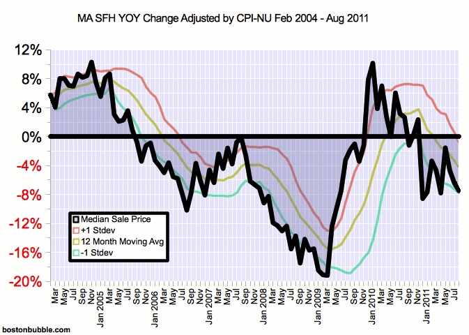
Some observations:
- The real decrease from August 2010 to August 2011 was 7.47%.
- Prices have resumed their downward trend after a period of twelve consecutive year over year increases. Those were the only year over year increases since August 2005 and they all occurred consecutively and after the most recent renewal and expansion of the home buyer tax credit. The moving average turned negative in April for the first time since the end of the tax credit. Price declines are once again the norm after being briefly interrupted by buyers being misled into mistaking one of many backdoor bank bailouts for a good buying opportunity.
- Real prices are once again lower than the same month in every year in the time period covered by The MAR. Additionally, the real median has plummeted back below the estimates for prior years and is now the lowest it has been since the estimate for 2000.
- Prices are now 28.49% below the peak set in June 2005. This is the result of a 15.72% decline in nominal housing prices and a 15.16% decline in the purchasing power of the dollar.
- The cumulative price decline from the beginning of the MAR's data (Feb 2003) is 11.26%, which is an annualized decline of 1.40%.
Of note this month, The MAR recently updated all of their price data for 2010 and 2011 to reflect new collection methods. The median prices have all been revised downward, mostly by low percentages. This is the first Boston Bubble Wrap to use the updated data.
The S&P/Case-Shiller Index for Boston is likely superior to the data above as it corrects for many flaws that are inherent when using only the median price. The S&P/Case-Shiller Index also has the advantage that futures contracts can be traded against it, thereby offering an unbiased insight into where housing prices are expected to be in the future. It also has more extensive historical data available. The MAR data was used for this report mainly out of inertia and might be replaced with the S&P/Case-Shiller Index in future reports.
As usual, please do try this at home. Double checking of the math used to construct the above graphs and analysis is strongly encouraged in order to help ferret out any errors. The data was derived from the following sources:
The text of this post and the associated graphs are Copyright 2011 by bostonbubble.com with all rights reserved, except as stated here. You may reproduce each graph individually or the text of the entire post as a whole (including graphs) under the Creative Commons Attribution-No Derivative Works 3.0 Unported License. You may additionally scale the graphs to fit your work. Alternatively, if you remove the bostonbubble.com signature from the bottom left hand corner of the images within this post, those modified images (and only those modified images) can then be distributed under the Creative Commons Attribution 3.0 Unported License. In all cases, attribution should be made via a hyperlink to http://www.bostonbubble.com/forums/viewtopic.php?t=3670 or http://www.bostonbubble.com/ Quoting excerpts of the text is also allowed provided that the quotes would normally fall under fair use. To request other terms for reproduction, please post your request in the original thread at http://www.bostonbubble.com/forums/viewtopic.php?t=3670
The latest version of this report can be found at http://www.bostonbubble.com/latest.php?id=ma_inflation
- admin |
|
| Back to top |
|
 |
FreedomCM
Guest
|
| Posted: Fri Sep 30, 2011 4:38 pm GMT Post subject: |
|
|
Once again excellent.
Are you working on an update of the CS/futures?
Thanks! |
|
| Back to top |
|
|
admin
Site Admin
Joined: 14 Jul 2005
Posts: 1826
Location: Greater Boston
|
| Posted: Mon Oct 03, 2011 3:36 pm GMT Post subject: |
|
|
| FreedomCM wrote: | Once again excellent.
Are you working on an update of the CS/futures?
Thanks! |
Thanks. I had skipped the last CS/futures update (and the last Boston Bubble Wrap) due to lack of time stemming from some recent personal commitments. I hadn't planned on updating it for the most recent quarter, unless a lot of people ask about it. I did, however, capture the price data for the futures on the day of most recent settlement and could post that if you're interested.
- admin |
|
| Back to top |
|
|
FreedomCM
Guest
|
| Posted: Mon Oct 03, 2011 5:13 pm GMT Post subject: |
|
|
| nah, don't do it for my edification. i can wait till next quarter. |
|
| Back to top |
|
|
DC2MA
Guest
|
| Posted: Thu Oct 06, 2011 1:45 pm GMT Post subject: So...how much are housing prices currently inflated? |
|
|
| Can you sum this up? We may soon have to move to the Boston area. What is your sense (in percentage terms) of the degree to which average house prices (for housing above the median) are currently inflated in the Boston suburbs? Am particularly interested in the northwestern suburbs around Concord. |
|
| Back to top |
|
|
Teavo
Guest
|
| Posted: Thu Oct 06, 2011 3:06 pm GMT Post subject: Great Work |
|
|
| I can wait too, but I just want to chime in and say I follow all these reports and regularly look forward to when you publish them. They're extremely informative and useful. |
|
| Back to top |
|
|
Renting in Mass
Joined: 26 Jun 2008
Posts: 381
Location: In a house I bought in December 2011
|
| Posted: Fri Oct 07, 2011 1:21 am GMT Post subject: |
|
|
Thanks as always Admin. You rock!
I made an offer on a house today. It was 35k under asking, so it will be interesting to see if they counter or reject it. |
|
| Back to top |
|
|
guest
Guest
|
| Posted: Fri Oct 07, 2011 2:21 pm GMT Post subject: |
|
|
| where the property is located renting? good luck for your offer. |
|
| Back to top |
|
|
admin
Site Admin
Joined: 14 Jul 2005
Posts: 1826
Location: Greater Boston
|
| Posted: Sat Oct 08, 2011 4:55 pm GMT Post subject: |
|
|
Thanks everybody.
Good luck with your offer, Renting.
DC2MA, regarding how inflated Boston area prices still are, I don't think that's a question that can be answered usefully in isolation and is a function of the economic context. For current mortgage rates and job environment, I would guess that we are fairly close to the bottom now, judging from the monthly payment to income ratio, though that is based on how most people bid up housing prices rather than what houses are inherently worth. I think that the typical individual's bidding strategy ignores risk when determining price, and interest rate risk is much higher than usual right now due to mortgage rates that are extremely low by historical standards. Extremely low interest rates are a single point of failure for current housing prices. The price to income ratio for the Boston MSA demonstrates how housing prices have been historically supported by incomes in the area over a range of mortgage rates and employment environments. There is plenty of scope for decline there - a 40% decline in the ratio would be within historical norms - mainly because mortgage rates have normally been much higher. Note that I'm not predicting that rates will necessarily rise anytime soon, I am just pointing out the if they did, the impact could be high. I also want to point out that if rates did spike and we did see a huge decline in the ratio, that would probably not translate into a 40% decline in nominal prices since the high rates would probably go hand in hand with high inflation, and therefore rising nominal incomes - so some of the decline would be in nominal prices, but a lot of it could be masked by money illusion.
- admin |
|
| Back to top |
|
|
CL
Guest
|
| Posted: Mon Oct 10, 2011 1:14 pm GMT Post subject: |
|
|
Good luck Renting.
As an aside, I read a "Rent or Buy" report from Deutsche Bank and that compare rent vs buy (taking property tax, insurance and tax saving into account) for metro areas in US. Buy becomes relatively attractive in early 2009 for a couple quarters, then again since late 2010. |
|
| Back to top |
|
|
john p
Joined: 10 Mar 2006
Posts: 1820
|
| Posted: Mon Oct 10, 2011 1:38 pm GMT Post subject: |
|
|
Way to go Renting; congratulations.
After looking at Admin's Charts I noticed something interesting and was wondering if anyone could explain it.
The first chart suggests a big change between 2007 and 2008 (there is a big gap). I see a cluster above and a cluster below.
The second chart suggests a huge "V" shape from July 07 to July 09. The steepest and longest line seems go be from March 2009 to September 2009 yet for the same period on the first chart, years 08, 09, and 10 are almost on top of eachother. |
|
| Back to top |
|
|
mpr
Joined: 06 Jun 2009
Posts: 344
|
| Posted: Tue Oct 11, 2011 1:51 am GMT Post subject: |
|
|
| john p wrote: | Way to go Renting; congratulations.
After looking at Admin's Charts I noticed something interesting and was wondering if anyone could explain it.
The first chart suggests a big change between 2007 and 2008 (there is a big gap). I see a cluster above and a cluster below.
The second chart suggests a huge "V" shape from July 07 to July 09. The steepest and longest line seems go be from March 2009 to September 2009 yet for the same period on the first chart, years 08, 09, and 10 are almost on top of eachother. |
Don't forget that the first chart shows prices, while the second chart shows change in prices, year over year. So in July 08 the second chart is very negative, corresponding to the big change from 07 to 08. For July 09, the second chart is almost back to 0 corresponding to the fact that July 08 and 09 are close together in the first chart.
I think the problem is that its hard to conceptualize what the YOY change number really means. The NAR uses it probably to give a very course indication as to the state of the market. For example, its not so easy to tell from the second chart exactly where the bottom of the market was in 2009.
Did you have a chance to get to "5000 years of debit ?" |
|
| Back to top |
|
|
admin
Site Admin
Joined: 14 Jul 2005
Posts: 1826
Location: Greater Boston
|
| Posted: Tue Oct 11, 2011 3:27 pm GMT Post subject: |
|
|
| john p wrote: |
The second chart suggests a huge "V" shape from July 07 to July 09. The steepest and longest line seems go be from March 2009 to September 2009 yet for the same period on the first chart, years 08, 09, and 10 are almost on top of eachother. |
Perhaps you're confusing some other year for 2008. The line for 2008 in the first chart is well above the other years, especially in March, which corresponds to the bottom of the "V" in the second chart. Yes, later in the year 2008 is flush with the others, but that corresponds to the right side of the "V" being a very steep and fast ascent up (which I would attribute to the last permutation of the homebuyer tax credit).
- admin |
|
| Back to top |
|
|
john p
Joined: 10 Mar 2006
Posts: 1820
|
|
| Back to top |
|
|
mpr
Joined: 06 Jun 2009
Posts: 344
|
| Posted: Thu Oct 13, 2011 3:12 am GMT Post subject: |
|
|
These are rather strange places to look for explanations to the housing bubble. The second one seems to be some wierd - probably anti-semitic in origin - conspiracy theory. The wikipedia entry on the first and second banks of the US dont even mention Nathan Rothschild.
'Rabbithole' seems to be the right word. |
|
| Back to top |
|
|
|
|
You can post new topics in this forum
You can reply to topics in this forum
You cannot edit your posts in this forum
You cannot delete your posts in this forum
You cannot vote in polls in this forum
|
Forum posts are owned by the original posters.
Forum boards are Copyright 2005 - present, bostonbubble.com.
Privacy policy in effect.
Powered by phpBB © 2001, 2005 phpBB Group
|

