 |
bostonbubble.com
Boston Bubble - Boston Real Estate Analysis
|
|
SPONSORED LINKS
Advertise on Boston Bubble
Buyer brokers and motivated
sellers, reach potential buyers.
www.bostonbubble.com
YOUR AD HERE
|
|
DISCLAIMER: The information provided on this website and in the
associated forums comes with ABSOLUTELY NO WARRANTY, expressed
or implied. You assume all risk for your own use of the information
provided as the accuracy of the information is in no way guaranteed.
As always, cross check information that you would deem useful against
multiple, reliable, independent resources. The opinions expressed
belong to the individual authors and not necessarily to other parties.
|
| View previous topic :: View next topic |
| Author |
Message |
john p
Joined: 10 Mar 2006
Posts: 1820
|
 Posted: Wed Oct 28, 2009 7:31 pm GMT Post subject: Posted: Wed Oct 28, 2009 7:31 pm GMT Post subject: |
 |
|
| Oh, there is another segment of people on this forum that think that Boston is past it's prime so it is smarter to rent and draw as much wealth as is available while there is still life left and then remain flexible to relocate in case this whole popsicle stand catches flames... |
|
| Back to top |
|
 |
admin
Site Admin
Joined: 14 Jul 2005
Posts: 1826
Location: Greater Boston
|
| Posted: Wed Oct 28, 2009 9:37 pm GMT Post subject: |
|
|
| Quote: |
The two issues I would have using your method are: first, your price to income data will always be a bit delayed because doesn't it take a while to get data on people's income? I have yet to find a source that shows the family median income in any given city that is current.
|
That is definitely true, but is it a problem? Given the multi-year stagnation of prices which followed the bottom in past recoveries, I'm not too worried about missing the bottom by not jumping in immediately when it occurs. If the lag of income data delays my purchase by a year, so be it. That's one year in the context of a 30 year commitment, a mere 3% delay to limit your risk of overpaying.
Furthermore, from a practical standpoint, the price to income ratio was so far above the average at last check that there was next to no chance that it would be at or below the average one year later without a drastic departure from its then current path of decline. If you're driving from New York City to Boston, you don't need to worry about missing your last exit before you've even hit the Mass. border. It may be nice to have some sort of supplementary metric with less of a lag once the average is in sight, though, and I actually did do that.
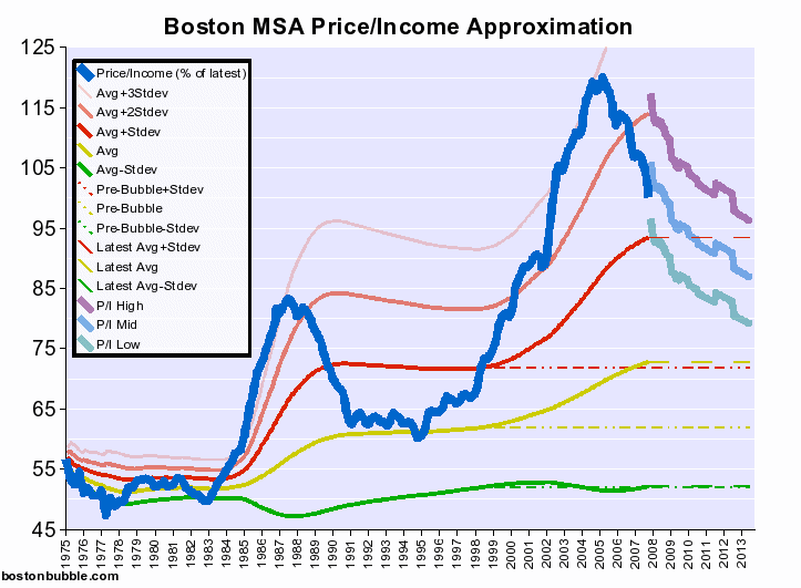
If you refer to the chart again, I actually have tried to work around the income lag by estimating what income has been since the last stats from the Census Bureau. That's where the thick blue line is replaced with a semi-transparent version of itself. That estimate is simply the historical, inflation adjusted average of the income data set. The lines above and below were produced with income estimates one standard deviation below and above the average, respectively. Last I checked, current incomes were slightly below the long term, inflation adjusted average. I think this makes a pretty decent estimate that negates just about all of any perceived downside in the lag of official income data.
| Quote: |
Second, your chart begins with the mid 70's and in many of the areas where housing was more "affordable" we also had much higher unemployment.
|
I'm not sure that's a problem either. The 1970's don't dominate the average - they're 15% of the total time. What's more, who's to say that unemployment wasn't closer to its natural level in the 1970's and that the apparent prosperity of the last few decades isn't the anomaly (e.g., caused by us mortgaging our future as the US transitioned from being the largest creditor nation to the largest debtor nation)? It's certainly good to understand the historical context behind the various portions of the graph, but excluding time periods would be vulnerable to misinterpretations of history and would also exclude things that could reoccur. It doesn't matter too much in this case, though, because that time period isn't dominant.
| Quote: |
Also, on the chart you referenced, what color line am I benchmarking to identify the target you're looking at?
|
The metric of interest is the thick blue line labeled "Price/Income (% of latest)". The signals that I would derive from it crossing some of the other lines are as follows:
- Avg + Stdev (red) - The absolute bare minimum decline that is necessary before I start thinking of buying based on the "affordability" trigger.
- Avg (yellow) - Time to start paying attention. I would start to look for decent deals, if I hadn't already.
- Pre Bubble (dashed yellow) - Actively try to buy.
- Avg - Stdev (green) - Go manic like Jim Cramer.
- admin
 |
|
| Back to top |
|
|
Renting in Mass
Joined: 26 Jun 2008
Posts: 381
Location: In a house I bought in December 2011
|
| Posted: Thu Oct 29, 2009 12:15 am GMT Post subject: |
|
|
| Quote: | | That's one year in the context of a 30 year commitment, a mere 3% delay to limit your risk of overpaying. |
I'm totally using that line in my next "when are we going to buy a house" conversation with my wife.
I like your Price/Income metric, but it's going to be a looooong time before that blue line crosses that yellow line  |
|
| Back to top |
|
|
admin
Site Admin
Joined: 14 Jul 2005
Posts: 1826
Location: Greater Boston
|
| Posted: Thu Oct 29, 2009 12:49 am GMT Post subject: |
|
|
| Renting in Mass wrote: |
I like your Price/Income metric, but it's going to be a looooong time before that blue line crosses that yellow line |
Yeah, I know. That's why I came up with trigger #2.
- admin |
|
| Back to top |
|
|
john p
Joined: 10 Mar 2006
Posts: 1820
|
|
| Back to top |
|
|
admin
Site Admin
Joined: 14 Jul 2005
Posts: 1826
Location: Greater Boston
|
| Posted: Thu Oct 29, 2009 2:49 pm GMT Post subject: |
|
|
| john p wrote: | It's kind of like
Red Light - No,
Yellow Light- Maybe,
Green Light - Yes
|
Yes, that was deliberate.
| john p wrote: |
Let's take the spike in the early/mid 80's; I think this has to do with the massive changes in the tax rates:
|
Could be. Or it could be because that is when interest rates and inflation started their long trend downward (and the US government started the transition from largest creditor nation to largest debtor nation).
| john p wrote: |
Let's look at the next spike in the mid 90's. I'd look at the growth in Subprime Lending (Community Reinvestment Act)
|
Or it could be a consequence of the dot-com bubble.
| john p wrote: |
The metric I'd always look at is the percentage of household income needed to service the mortgage payment:
|
The problem with this metric is that it does not account for risk. For a given mortgage payment, the lower the mortgage rate, the higher the risk of price declines precipitated by rising rates. This risk is unusually large right now given that mortgage rates are 1) already at historic lows and 2) being artificially held down by direct government intervention which they intend to end (supposedly in 2010 Q1 was the latest word, I think). This is the reason that I want to buy when rates are higher. It's not about setting myself up for refinancing opportunities later (though that's a nice bonus), it's about avoiding the abnormally high level of risk baked into the rates right now.
- admin |
|
| Back to top |
|
|
admin
Site Admin
Joined: 14 Jul 2005
Posts: 1826
Location: Greater Boston
|
| Posted: Thu Oct 29, 2009 5:18 pm GMT Post subject: |
|
|
| john p wrote: | It's kind of like
Red Light - No,
Yellow Light- Maybe,
Green Light - Yes
|
Of course, we are in Boston where it's more like:
Green Light - Go
Yellow Light - Go
Red Light - Only the next 6 cars may go.
- admin |
|
| Back to top |
|
|
|
|
You can post new topics in this forum
You can reply to topics in this forum
You cannot edit your posts in this forum
You cannot delete your posts in this forum
You cannot vote in polls in this forum
|
Forum posts are owned by the original posters.
Forum boards are Copyright 2005 - present, bostonbubble.com.
Privacy policy in effect.
Powered by phpBB © 2001, 2005 phpBB Group
|

